A community-driven commerce platform.
- Project Type:
- Hackaton
- My Role:
- UX/UI and Branding
- Team:
- Rafael Ramos, Developer
Gilberto Melgarejo, Developer
Javier Pech, Research
Gabriela Cetzal, Research - Project Timeline:
- 24 hours
- Project Stack:
- Figma, Figma Jam, Github, React, Vite
PÉEK
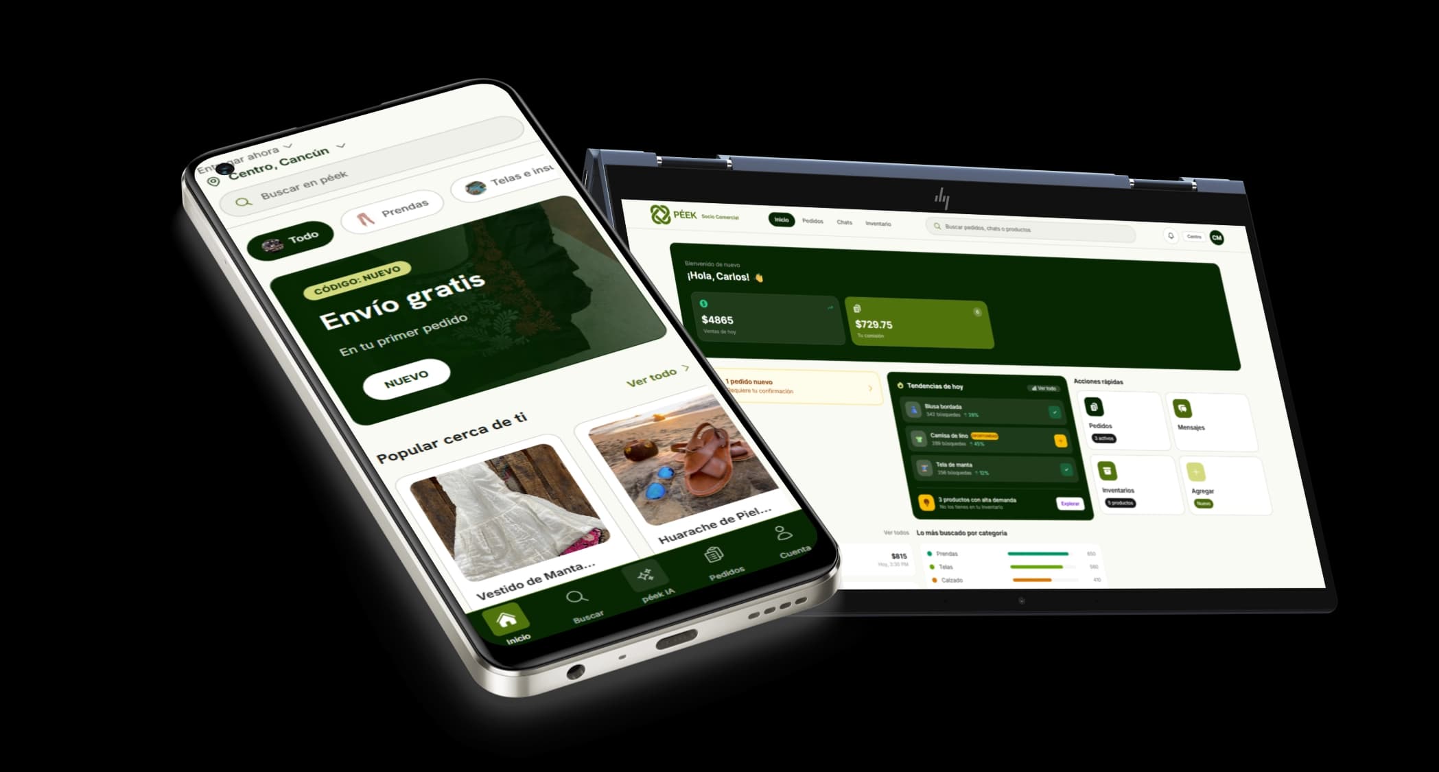
Péek is a platform concept designed to help local micro and small businesses participate in digital commerce, regardless of their level of technological adoption. By connecting producers, intermediaries, delivery partners, and consumers within a single ecosystem, the project explores how technology can strengthen local economies and create new opportunities for businesses that are often excluded from modern distribution channels.
Context
Péek was created during local stage Hackatec 2026, a 24 hour innovation competition focused on developing solutions to real world challenges. The project emerged as an evolution of a concept previously explored by the team, one that had already demonstrated strong potential and earned national recognition in an earlier competition.
Rather than simply recreating the original idea, the goal was to expand it. Through additional research and discussion, we identified opportunities to support a broader range of small businesses and entrepreneurs facing different challenges. This shift allowed us to rethink the product from a wider perspective and develop a more complete ecosystem while preserving the original mission of supporting local economic growth.
As a Product Designer, my role involved translating research, ideas, and business opportunities into product concepts, user flows, wireframes, and experiences that could be rapidly validated and communicated to the development team during the limited timeframe of the competition.
Challenge
The biggest challenge wasn't designing the product it was designing it fast.
Hackathons are unique because they compress what would normally take weeks or months into a single day. In just 24 hours, our team needed to understand a real world problem, conduct research, define a solution, design an MVP, prepare a pitch, and align five people around a shared vision.
As a Product Designer, this meant making decisions with limited information while continuously adapting to new findings and ideas. Every hour mattered. There was little time to overthink, making collaboration, communication, and prioritization just as important as the design work itself.
Perhaps the most difficult part was balancing ambition with reality. We wanted to create a solution capable of addressing a meaningful problem, but we also had to remain realistic about what could be researched, designed, and presented within such a short timeframe. The experience reinforced an important lesson: great products are not built by individuals working separately, but by teams moving together toward the same goal.
Research
Before defining features, user flows, or interfaces, the team focused on understanding the problem itself.
One of the most surprising findings was the scale of the role that micro and small businesses play within Mexico's economy. Despite representing the vast majority of economic units and contributing significantly to national economic activity, many operate with limited access to digital tools, modern distribution channels, and scalable commercial opportunities.
As we explored the problem further, we discovered that the challenge extended beyond digital adoption. Many local producers already create valuable products, but struggle to reach larger markets, connect with potential customers, or participate in modern supply chains. The result is a disconnect between supply and demand: products exist, consumers exist, yet both sides often fail to find each other.
What stood out most to me was the contradiction at the center of the problem. Small businesses help sustain local economies across the country, yet many disappear within a few years due to limited opportunities, operational challenges, or lack of access to broader markets. The issue was not a lack of talent, effort, or products it was often a lack of visibility and connection.
These insights shifted our perspective. Rather than designing exclusively for businesses that were already comfortable operating online, we began exploring how a solution could support different levels of digital maturity. This led us to think beyond a single user type and toward a broader ecosystem capable of connecting multiple participants while reducing barriers to participation.
Key Research Insights
- 99.8% of businesses in Mexico are micro and small enterprises.
- 52% of Mexico's GDP is generated by micro and small businesses.
- 19% of micro businesses have access to computers.
- 4 Million businesses operate with limited access to digital commerce and distribution channels.
- Thousands of local products never reach broader markets despite existing consumer demand.
User flows
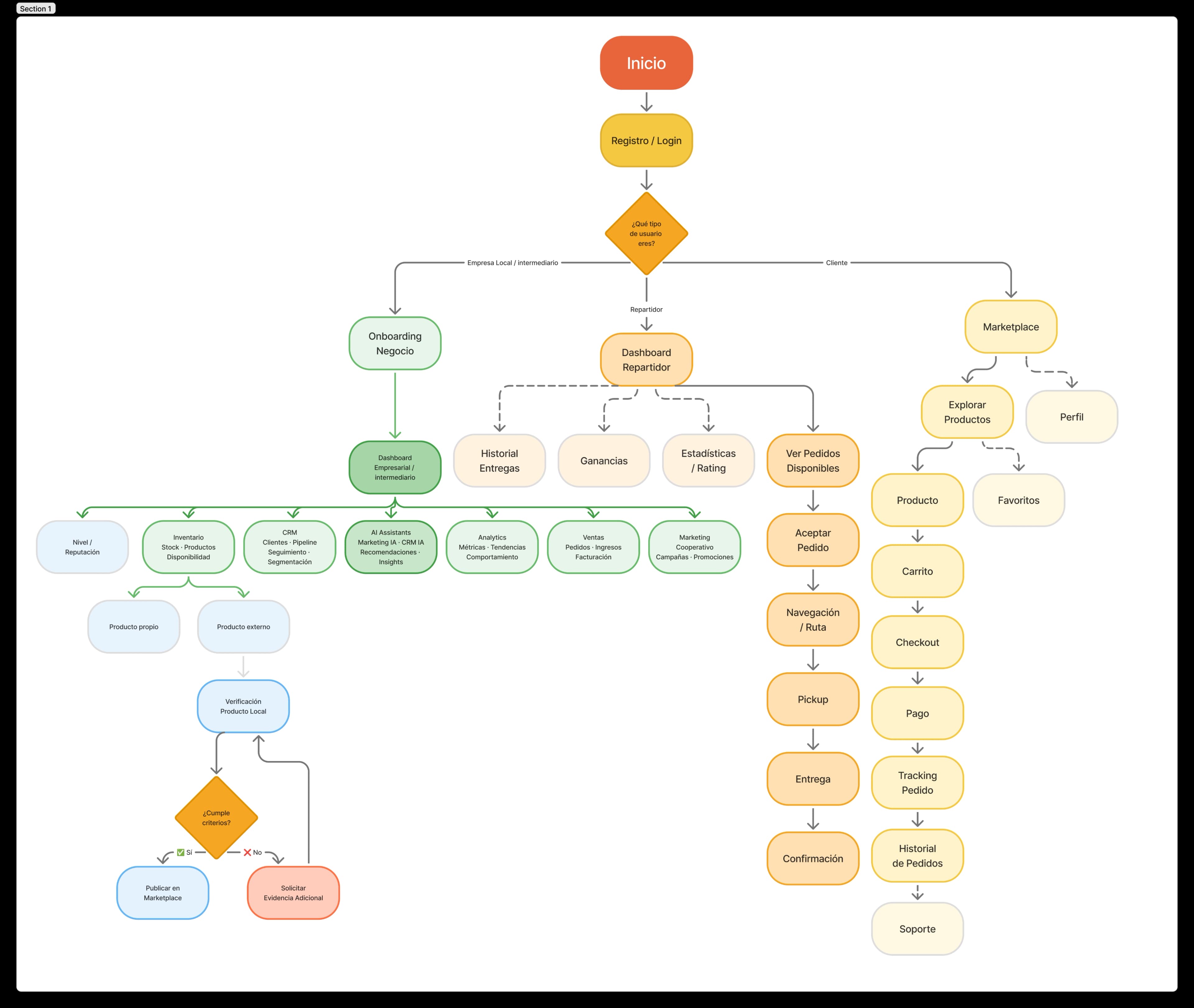
The primary goal of this user flow was to create a connected ecosystem where businesses, intermediaries, delivery partners, and customers could interact through a single platform. Based on research findings, the flow was designed to reduce barriers for small businesses while providing each user type with the tools and information relevant to their role.
By separating experiences into dedicated pathways while maintaining a unified system, Péek enables businesses to manage operations, customers to discover and purchase local products, and delivery partners to fulfill orders efficiently. The result is a scalable experience that supports the movement of products, services, and opportunities throughout the local economy while remaining accessible to users with different levels of digital experience.
Final Deliverance
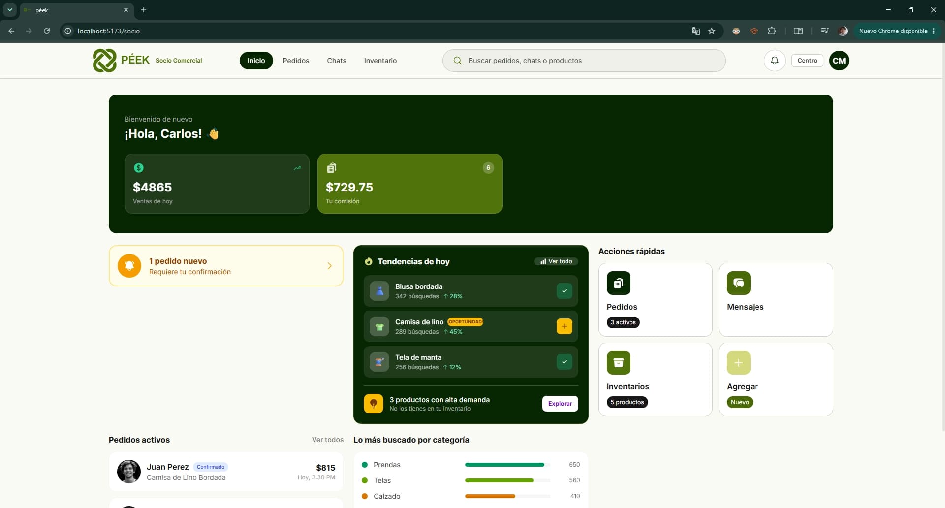
At the end of the 24 hour sprint, our team delivered a complete product proposal supported by research, product strategy, user flows, wireframes, branding, interface designs, and a functional MVP prototype.
As a Product Designer, my contribution focused on translating ideas into tangible experiences. This included defining product flows, creating low-fidelity wireframes, developing the visual direction of the platform, and collaborating closely with both developers and teammates to ensure the solution remained aligned with the problem we set out to solve.
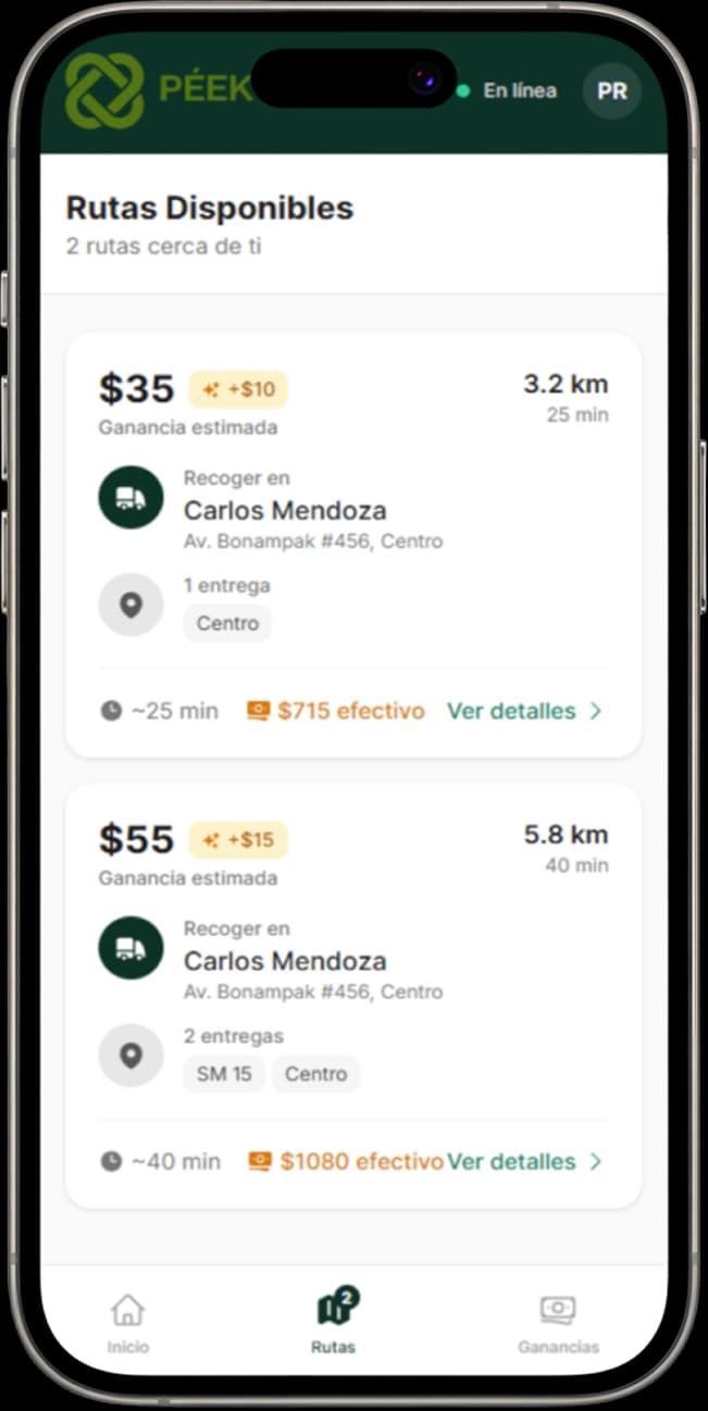
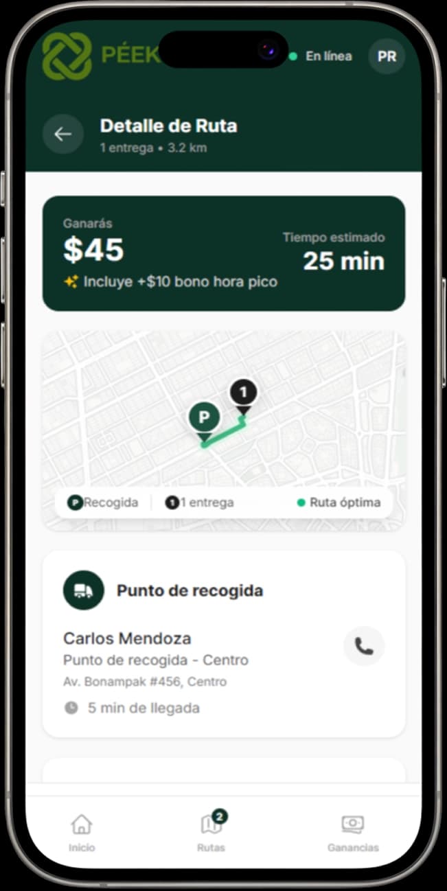
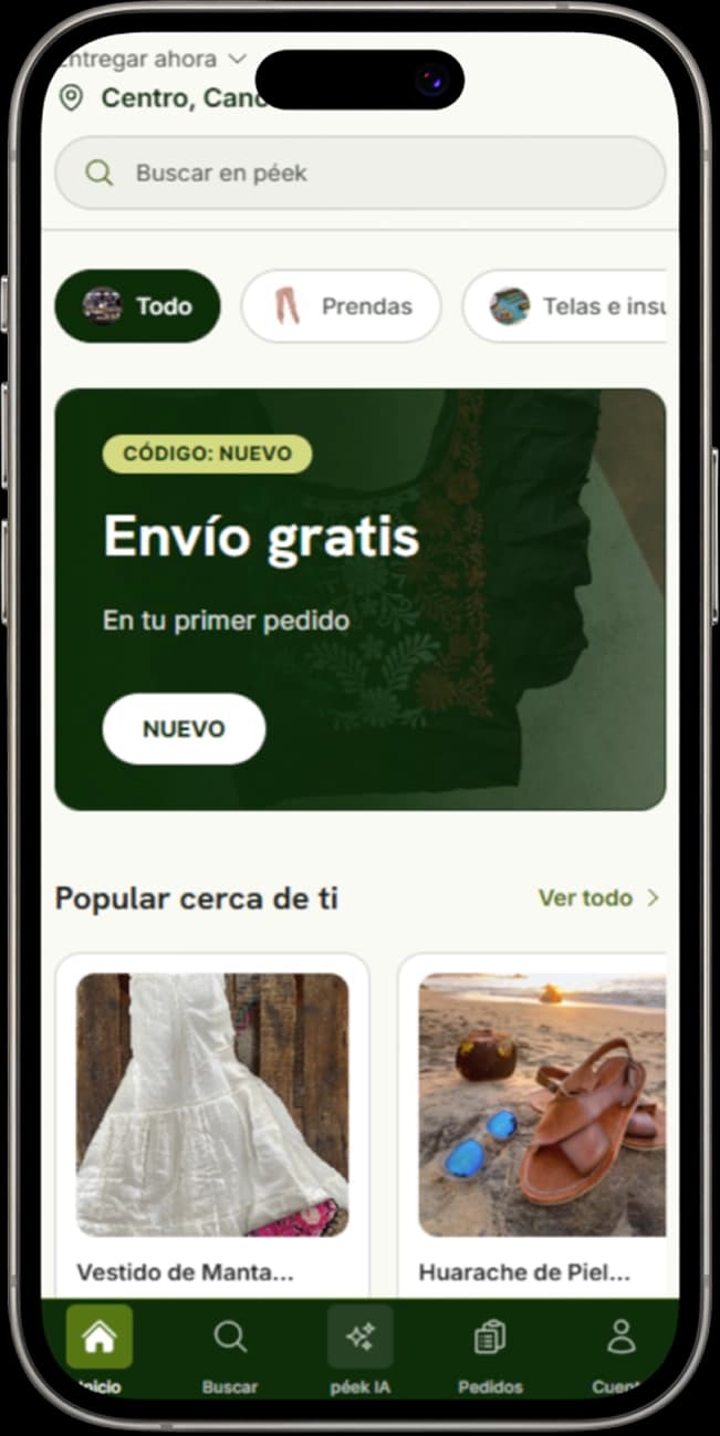
More importantly, the project demonstrated our ability to move from research to execution under extreme time constraints. The final result was strong enough to advance to the regional stage of Hackatec 2026, validating both the concept and the team's collaborative approach to problem solving.
While the solution continues to evolve, this iteration represents an important milestone in the project's journey and a reminder of what can happen when research, design, development, and teamwork come together around a shared goal.
Branding
Icon / Logo
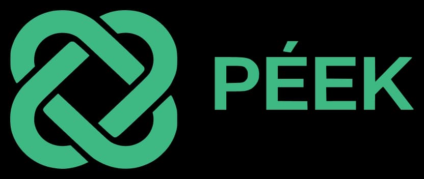
The Péek logo was designed to represent connection and movement within a commercial ecosystem. Rather than focusing on a single participant, the symbol reflects the relationship between multiple actors working together to create opportunities and strengthen local economies.
Its simple geometric structure allows it to remain recognizable across digital and printed applications while supporting the project's goal of accessibility. The logo was intentionally designed to feel modern and professional without appearing overly corporate, helping create a balance between innovation and community.
Name
The name Péek comes from the Mayan language and translates to concepts such as movement, motion, and pulse.
That idea became the foundation of the brand. Throughout the research process, one theme appeared repeatedly: local businesses often have the talent, products, and ambition to grow, but lack the opportunities needed to move forward. Péek was created to help generate that movement connecting people, products, and opportunities in ways that strengthen local commerce.
Colors
The color palette was inspired by themes of growth, commerce, and trust. Small businesses often operate in environments filled with uncertainty, so the visual identity needed to communicate stability while remaining optimistic and approachable.
Green tones were used as the primary brand colors to represent growth, opportunity, and prosperity. Supporting neutral colors provide balance and readability across the platform while ensuring that data, products, and business information remain the focal point of the experience.
Together, the palette creates a professional yet welcoming atmosphere that reflects the project's mission of helping local businesses grow through stronger connections and greater visibility.
Reflection
Projects born from competitions like this are often more about communication, patience, and organization than they are about coding even if they're called hackathons.
When you're working with a team, the real challenge is learning how to align ideas, divide responsibilities, make decisions quickly, and, most importantly, not kill the teammate sitting next to you after the tenth hour of work. In many ways, building the right solution becomes just as important as building the solution itself.
This was my fifth hackathon, and every single one has taught me something different. The national stages can last multiple days, usually with very little sleep, a lot of pressure, and countless last minute changes. Yet somehow, they're always incredibly fun. You leave exhausted, but you never leave the same person you were when you arrived.
Most importantly, Péek reminded me why I enjoy these experiences so much. Beyond the competition, the presentations, and the deadlines, there is something incredibly rewarding about using my skills to help solve real problems and contribute, even in a small way, to the growth of local communities and businesses in my country.
Thanks for taking the time :D