Public transparency made understandable.
- Project Type:
- Hackaton
- My Role:
- UI designer, Branding and Marketing
- Team:
- Rafael Ramos, Developer
Gilberto Melgarejo, Developer
Javier Pech, Research - Project Timeline:
- 1 week
- Project Stack:
- Figma, Canva, Afinity
KAAN
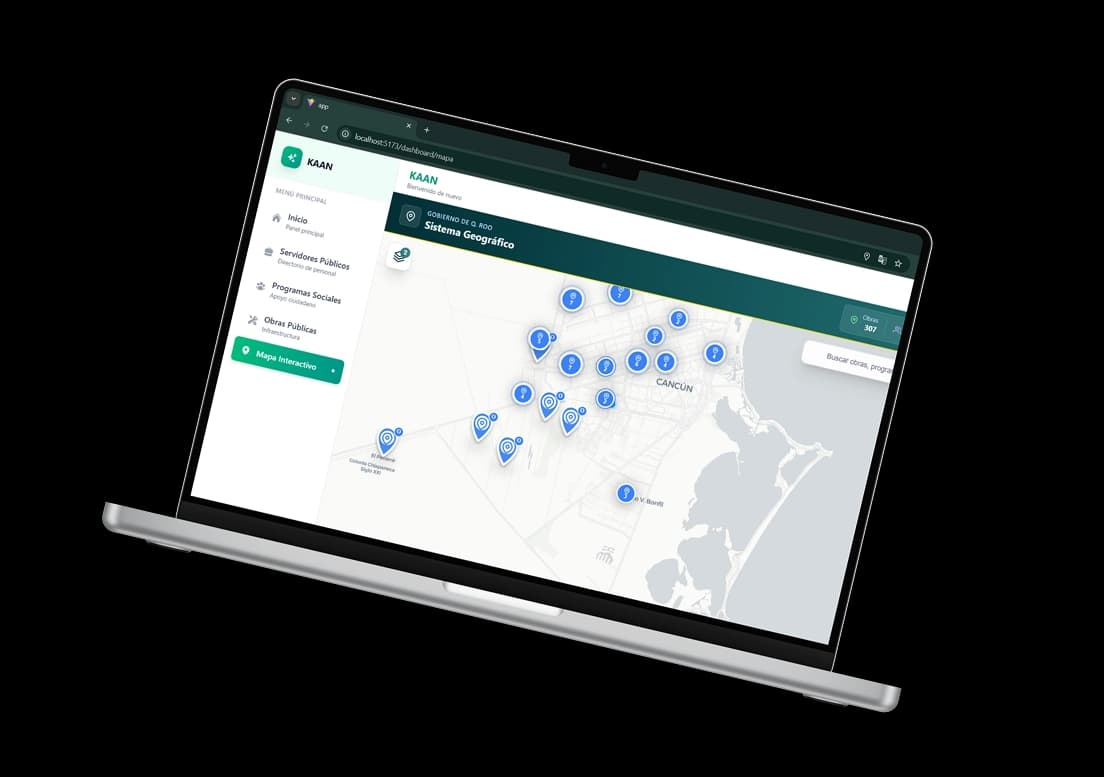
Kaan is a citizen transparency platform concept designed to make public information more accessible, understandable, and actionable for residents of Quintana Roo. By bringing together government data, public services, citizen reports, and community information into a single experience, the project explored how design could help bridge the gap between citizens and the institutions that serve them. The original prototype relied on public data APIs provided during the competition. Since the event concluded, access to some of these APIs has been discontinued, which means certain features showcased in this case study are no longer fully functional in the live demo.
Context
Kaan was developed as part of ComeDatos, a state wide innovation competition focused on creating technology driven solutions using public data provided by the Government of Quintana Roo. Unlike traditional hackathons, teams were given one week to research, design, develop, and prepare a complete proposal before presenting it at a final exhibition in Chetumal.
As part of the competition requirements, teams were expected to think beyond the product itself. In addition to developing a functional solution, participants needed to create a visual identity, social media presence, communication strategy, and public facing materials capable of attracting attention and explaining the project's value.
As a UI Designer and Brand Manager, my role focused on shaping the visual identity of Kaan, designing parts of the platform experience, developing marketing materials, and helping communicate the product through both digital channels and the final exhibition.
Challenge
Designing a platform centered around transparency proved to be more difficult than expected.
Unlike entertainment, social, or productivity products, public information platforms often contain large amounts of complex data that can quickly become overwhelming. The challenge was not simply displaying information, it was making it approachable, understandable, and engaging enough that citizens would actually want to use it.
At the same time, the project required balancing the needs of multiple audiences while working within a limited timeframe. The team had to transform government datasets, public services, and civic information into a cohesive experience while also creating a brand capable of generating interest and trust. Finding the balance between functionality, clarity, and visual appeal became one of the defining challenges of the project.
Research
Before designing the platform, the team focused on understanding why citizens often feel disconnected from public information and government services.
One of the clearest findings was not the absence of information, but the difficulty of accessing it. Data related to public works, social programs, public officials, health statistics, energy monitoring, and government procedures already existed across multiple sources. The challenge was that this information was fragmented, difficult to navigate, and often inaccessible to the average citizen.
This fragmentation creates a wider problem. When people struggle to find reliable information, trust decreases, participation drops, and public perception is often shaped by assumptions rather than facts. During the research process, we found statistics showing that a large percentage of citizens perceive corruption, many are unfamiliar with their representatives, and only a small percentage actively participate in civic matters. While these numbers were not surprising, they reinforced the importance of making public information easier to discover and understand.
What surprised me most was realizing how few integrated solutions existed for citizens. While government information portals and public databases are available, they are often separated across multiple websites, departments, and systems. As a result, citizens are frequently left searching through different sources without knowing where to begin or who to contact when they need help.
These findings shaped the direction of Kaan. Rather than creating another repository of information, the goal became building a more accessible and understandable experience one capable of bringing together information, services, and citizen participation into a single platform.
Key Research Insights
- Information often exists, but is distributed across too many disconnected sources.
- Citizens frequently struggle to identify the correct government office, representative, or service for their needs.
- Transparency is not only about publishing data, it is also about making that data understandable and accessible.
- Public platforms must balance large amounts of information without overwhelming users.
- Trust and participation improve when citizens can easily understand what is happening in their communities.
Final Deliverance
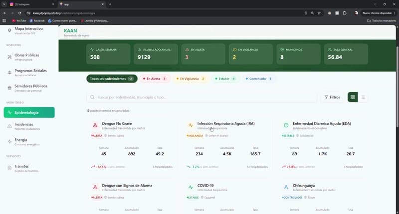
At the end of the competition, our team delivered a complete citizen transparency platform supported by a functional prototype, visual identity, social media campaign, presentation materials, and a public exhibition stand.
The platform brought together multiple public services and information sources into a single experience, including government procedures, public works tracking, social programs, epidemiological information, citizen incident reporting, public official directories, and municipal energy monitoring. The goal was to create a more accessible way for citizens to interact with information that already existed but was often difficult to find or understand.
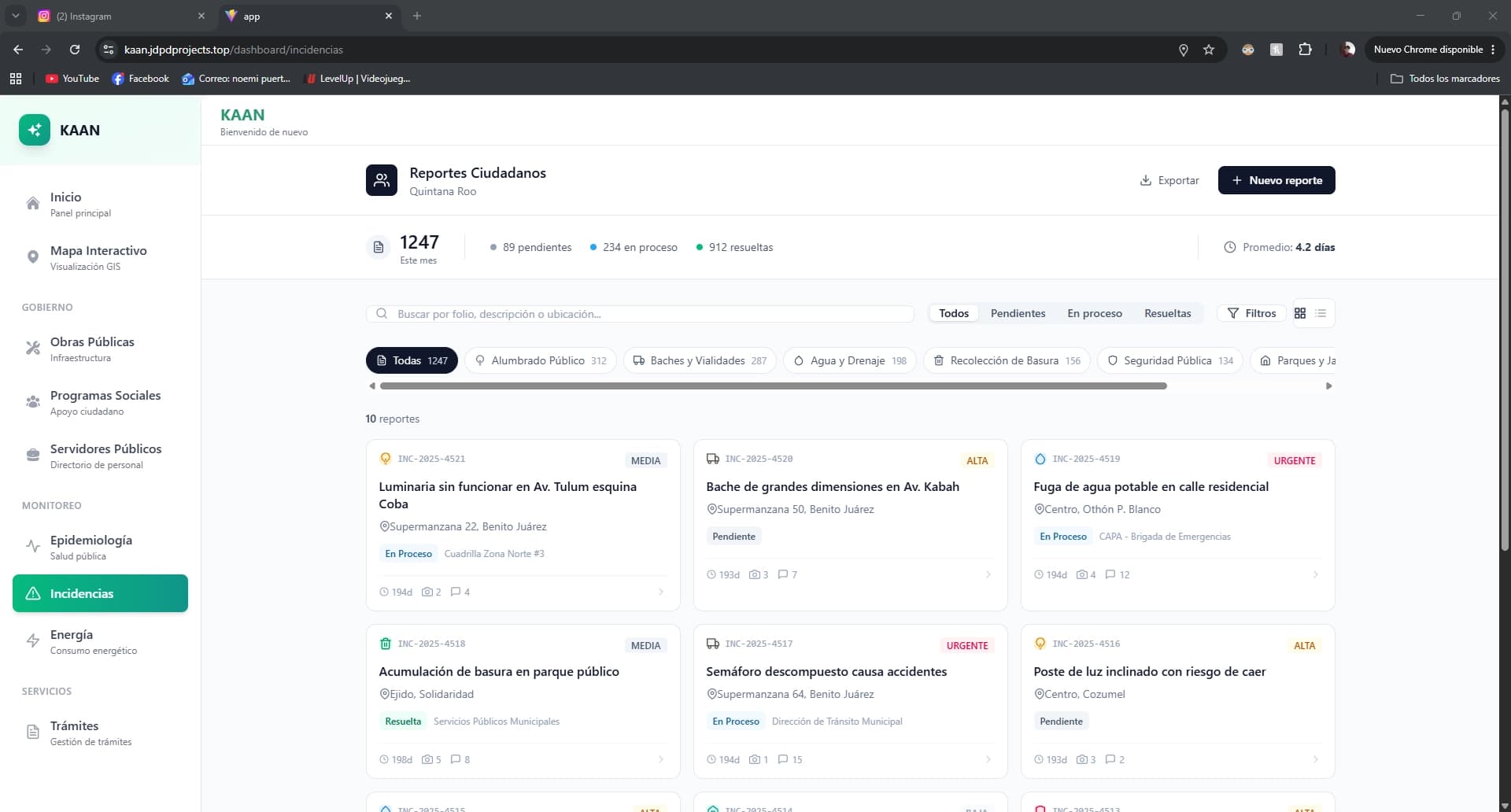
My contribution focused on the visual and communication side of the project. I designed portions of the user interface, developed the platform's branding and visual identity, created promotional content for social media, and helped communicate the value of the solution during the final exhibition. This allowed me to work beyond the product itself and think about how users would first discover, understand, and engage with the platform.
While Kaan did not advance beyond the final stage, the project successfully qualified among the selected teams invited to present in Chetumal and remains one of the most unique competition experiences I have participated in due to its combination of product design, branding, public communication, and civic impact.
Branding
Creating Kaan meant building a visual identity around a challenge that many citizens experience every day: information exists, but finding it often feels impossible.
The platform was designed to make public information more visible, understandable, and accessible. As a result, the brand needed to communicate transparency, trust, and clarity while remaining approachable to people with different levels of digital literacy. Inspired by both modern civic technology and the cultural roots of Quintana Roo, Kaan's visual identity aimed to bridge the gap between government data and the citizens it was created to serve.
Icon / Logo
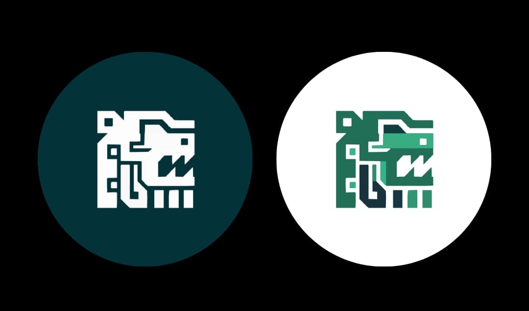
The Kaan logo was inspired by Mayan visual language and geometric forms commonly found throughout the cultural heritage of the Yucatán Peninsula. The symbol combines angular shapes with a modern digital aesthetic, creating a visual identity that feels both rooted in tradition and relevant to contemporary technology.
At its core, the icon represents connection, communication, and access to information. Its structured appearance reflects the platform's purpose of organizing complex public data into a clear and accessible experience for citizens. The modular construction of the symbol also mirrors the way Kaan brings together information from multiple sources into a single platform.
By combining cultural references with a modern interface-oriented design, the logo helps position Kaan as a bridge between public institutions and the communities they serve.
Name
The name Kaan comes from the Mayan language, where it is commonly associated with the word “serpent.” Throughout Mayan culture, the serpent appears as a powerful symbol connected to knowledge, communication, movement, and connection between different worlds.
The name was chosen not only because of its cultural significance within the region, but also because it reflects the platform's purpose. Kaan was designed to connect citizens with information that is often fragmented across multiple government systems, helping transform disconnected data into accessible knowledge.
As a project developed in Quintana Roo, using a Mayan name also serves as a tribute to the region's history and identity, reinforcing the platform's commitment to local communities and civic engagement.
Colors
The color palette was built around shades of teal and deep green, colors commonly associated with trust, transparency, stability, and public service. Unlike many government platforms that rely on rigid institutional aesthetics, Kaan aimed to feel approachable while still maintaining credibility.
The darker tones establish confidence and professionalism, while the lighter accents create contrast and improve readability across interfaces, social media content, and promotional materials. These colors were also chosen for their connection to the natural landscapes of Quintana Roo, creating a visual identity that feels both modern and regionally grounded.
Together, the palette supports the platform's mission of making public information more accessible, understandable, and engaging for everyday citizens.
Marketing Strategy
One of the competition requirements was demonstrating public interest and community engagement around the project. Rather than treating social media as a simple checkbox, Kaan's marketing strategy focused on making government transparency feel relevant, understandable, and approachable to everyday citizens.
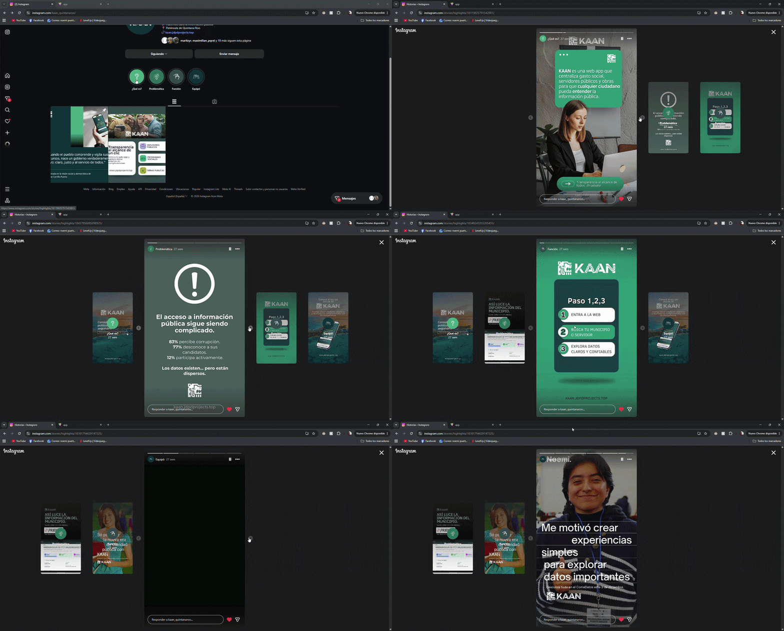
The campaign was built around a single objective: generate awareness and encourage people to explore the platform for themselves. Instagram became the primary communication channel, where educational stories and posts explained four key topics: the problem, the solution, how the platform worked, and the team behind the project. Each piece of content was designed to answer common questions while directing users back to the platform through clear calls to action.
To complement the digital strategy, the project also incorporated an on-site activation during the final event in Chetumal. Through posters, informational brochures, branded stickers, and direct conversations with attendees, the team transformed the stand into an interactive touchpoint for potential users. Rather than relying on technical explanations, conversations often began with a simple question:
“How many public works projects do you actually know about in your community?”
This approach helped create curiosity while opening discussions around transparency, public spending, and citizen participation. The campaign was guided by one of the project's central messages:
“When people understand and monitor their resources, a government truly becomes their own.” — Felipe Carrillo Puerto
Results
- KPI Goal: 40 Instagram followers
- Final Result: 61 followers (+52.5% above target)
- Average engagement per publication: 27–31 interactions
- Instagram Stories were used as permanent educational content explaining the platform's purpose, functionality, and impact
- Physical outreach at the event proved to be the most effective acquisition channel, generating meaningful conversations and driving visitors directly to the platform
Beyond the numbers, the strategy validated an important idea: citizens are interested in transparency when information is presented in a way that feels accessible, relevant, and connected to their everyday lives.
Reflection
By the time Kaan came around, my team and I were tired.
We had spent months competing, studying, working, and building projects, so the idea of jumping into another competition at the end of the year sounded a little crazy. But looking back, I'm glad we did.
Kaan pushed me into areas I don't usually get to explore. Beyond designing interfaces, I worked on branding, social media, communication strategies, and even presenting the project to people visiting our stand. It was a very different experience from the projects and competitions I had done before, and that alone made it worthwhile.
We didn't win, and honestly, that's okay. What I remember most is how much fun it was to build something meaningful with my team, meet new people, and spend a week turning an idea into a real product. These competitions always leave me with new skills, new perspectives, and a reminder that some of the best learning experiences happen outside the classroom.
For a final project before the end of the year, it wasn't a bad way to finish 2025.